ABOUT ME & MY RESULTS > EXAMPLES OF MY WORK > CASE STUDY: DIRECT EXPRESS
CASE STUDY:
Modernizing Government Benefits with Direct Express
A partnership between Mastercard and the U.S. Treasury to redesign the experience of receiving federal Social Security payments in the United States
TL;DR
Role: UX Researcher • Context: Federal benefits (Direct Express) • Methods: Depth interviews, usability, synthesis • Outcomes: 95% C-SAT; $1B+ est. savings; adopted as default for millions
What was it? Why do I care?
-
In collaboration with the U.S. Treasury, Mastercard set out to modernize how Social Security recipients - often unbanked or underbanked - receive their benefits.
The existing process relied heavily on mailed checks and clunky call-in systems for even basic tasks, such as checking balances
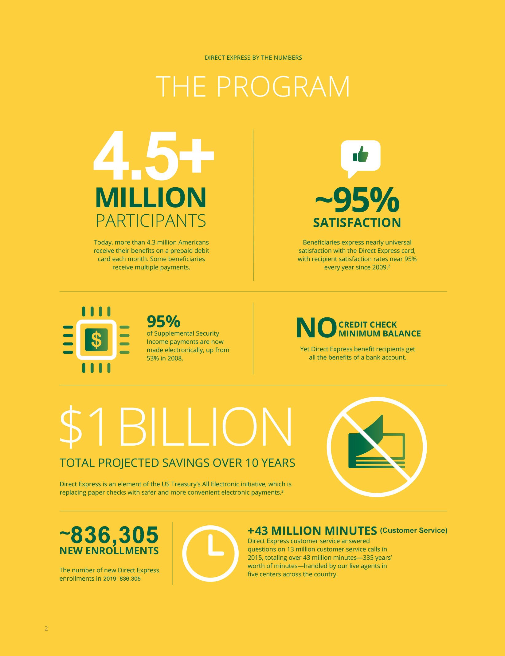
Estimated waste = $1B over 10 years
-
Change benefit payments from mailed physical checks to direct deposits on reloadable prepaid Mastercard cards
Design a digital product experience that makes it:
Easy for recipients to access and manage their funds
Cost-effective and scalable for the government
Secure, accessible, and trustworthy for a population often excluded from tech innovation
-
BEFORE THE STUDY
Understand the problem space, and goals of the end-user using this product
Collaborated with the Product team to determine participant profiles / personas for the research
Coordinated with the market research vendor on study logistics and participant sourcing
Developed the research plan / discussion guide to explore:
The kind of help recipients would regularly have available to them
Money management behaviors
Pain points of the current system and prototype app
Trust signals
DURING THE STUDY
Greeted & re-screened participants to ensure they reflected our target users / personas:
Older adults
Adults with physical and mental disabilities
Lower-income individuals
Those with low digital literacy
Executed the usability study leveraging the research plan / discussion guide approved by my stakeholders
AFTER THE STUDY
Synthesized findings for the product and strategy teams to guide the next phase of prototyping and development
Presented my findings to the client (and other stakeholders)
-
“Trust” beats “Innovation”: Users were more concerned with knowing their funds were safe and reachable than having fancy new features
Having a smartphone doesn’t equal “digital literacy”: Many participants had mobile phones but didn’t trust apps, which reframed our onboarding assumptions
Checking balances was an anxiety-relief ritual - keep balance persistent and easy to access: For many, calling in to check their balance was a daily anxiety-relief habit. We needed to honor that behavior in the design, not erase it
It had to work equally well for both benefit recipients and caretakers
-
The resulting product changes helped streamline onboarding, reduce anxiety through thoughtful UI language, and emphasized balance visibility front-and-center
The U.S. Treasury adopted the updated platform, and the Direct Express program became a national benchmark for digital benefit distribution
95% user satisfaction
$1B+ estimated savings over 10 years
Adopted as the default payment method for millions of federal benefit recipients
-
This was the project that made me understand how much UX Research truly matters. It’s not about making things easier to click - it’s about dignity, trust, and systemic impact
I saw how asking the right questions could shape a product that would ultimately change people’s lives for the better